Creating an Interstitial Page

Some screenplays begin with a special page that contains only a quotation or other text meant to set the context for the story. The Hurt Locker, for example, starts with a page featuring two quotations about mankind and war.

You can do this in Slugline with manual page breaks, but for now, this means the first actual page of your screenplay will then be numbered as page 2. In the world of screenplays, page count matters, so this is kind of a bummer.

We have plans to make this work better, but for the time being, there’s a pretty easy workaround that takes advantage of one of the post powerful and underestimated apps on the Mac: Preview.

Preview isn’t just for viewing images and PDFs. It also has many powerful editing abilities, including re-ordering pages, and even inserting pages from one document into another.

So, to create an interstitial page, just save two PDFs — one of your screenplay, and another with just the special page. Then open both, and drag the single page into the thumbnail pane of the screenplay, inserting it exactly where you want it.

Here are some tips:

  • If Preview opens without the Thumbnails visible, reveal them by choosing View → Thumbnails.
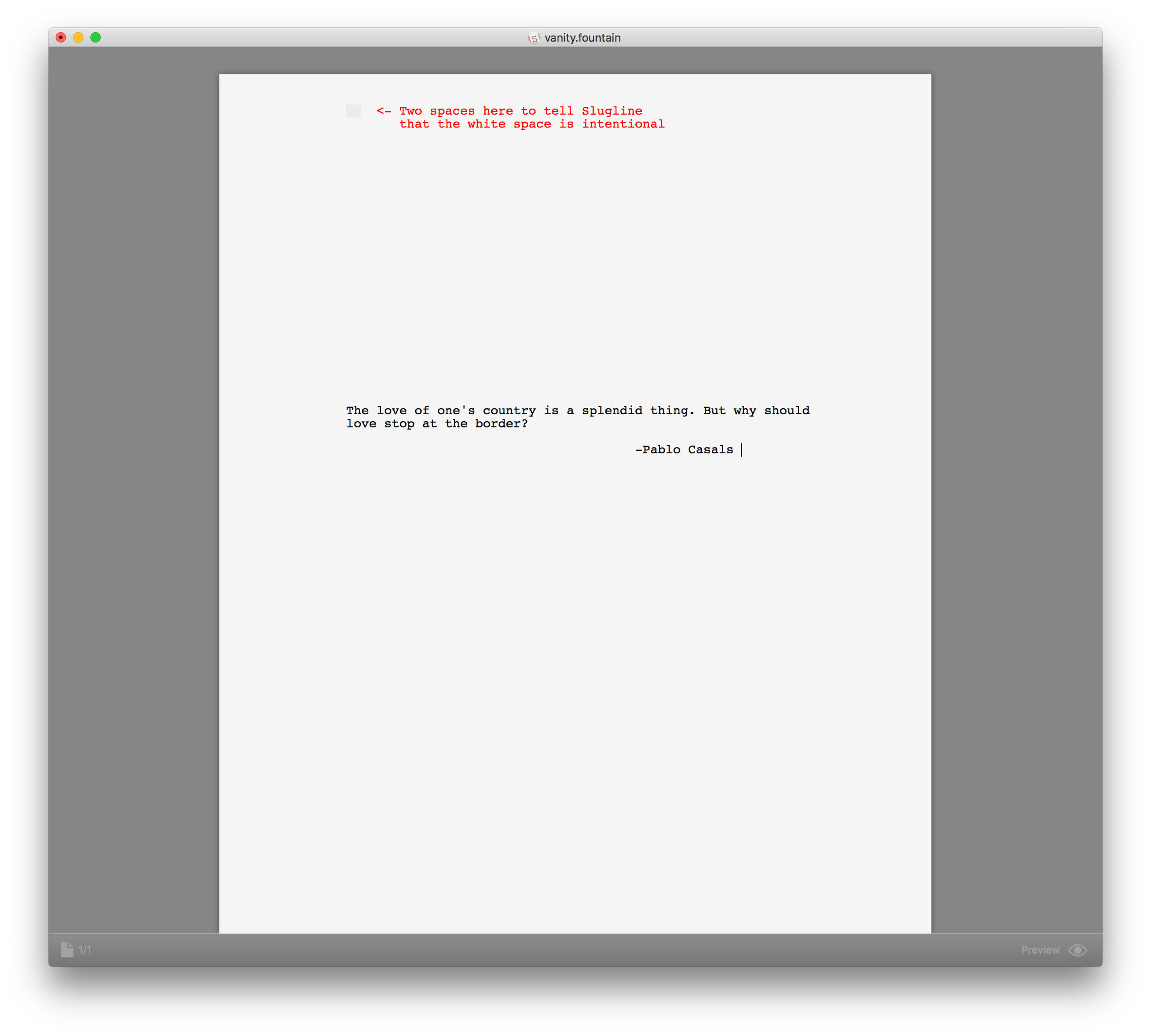
  • When creating the document for the interstitial page, you’ll probably want some white space above the text to center it vertically on the page. You can create this with a few carriage returns, but to make sure Slugline prints those lines as intentional white space, add 2 spaces to the very first line of the document.
  • This technique can also be used for adding a fancier title page, with whatever fonts or imagery you like. Create the title page of your dreams in any app that outputs PDF, then insert it according to the above instructions.

Click to enlarge:

We’ll make this process much easier in a future version of Slugline, but for now, this is a powerful way to customize your PDF screenplays.

Stu MaschwitzHow to
Oscar Sale!

It‘s Oscar time! This Sunday, people are going to win gold statues for writing words on a page. That‘s pretty cool. Maybe even a little inspirational.

So Slugline is on sale today through Oscar Sunday for 25% off, or $29.99 USD.

Go get 'em, Tiger.

Stu Maschwitz
Slugline 1.2.2

Slugline 1.2.2 is available now in the App Store. This is a minor update to 1.2.1 that fixes a rare, but annoying case where quotation marks, apostrophes, and dashes could be replaced by their “smart” equivalents. This could happen inconsistently, leaving you with half-smart quotes, like this:

Nobody wants half-smart quotes, but since not everyone agrees about whether smart quotes belong in a screenplay, this is a good opportunity to discuss Slugline’s approach.

Type and Writers

The bug was brought to our attention by noted actor, author, and British Person Stephen Fry, who we were delighted to find is an adoring Slugline user. In his detailed bug report, he wrote:

[Smart quotes] are stylistically wrong for fixed width fonts such as Courier, Courier Prime etc.

It so happens that we tend to agree. We love that screenplays feel typed, not typeset. So Slugline uses typewriter-style straight quotes and apostrophes, rather than trying to cleverly replaced them with the curly varieties:

Slugline does this irrespective of your System Preferences, which are a bit coarse when it comes to this stuff:

Notice that the toggle for replacing quotes is linked to replacing dashes. We’ve designed Slugline to ignore this setting, as your general-purpose preference here may not match your desires when screenwriting. For writing emails, blog posts, and just about anything other than a screenplay, curly quotes, proper apostrophes, and en- and em-dashes are wonderful things. But in the monospace, typewriter-emulation model of screenwriting, things are less clear-cut.

For example, take the age-old debate about two spaces after a period. It’s always wrong to put two spaces after a period when using a proportional font. But with Courier or the like, it’s a matter of personal preference.

Some writers might love smart quotes in their screenplays. They can look fine, especially in Courier Prime. Here’s an example:

But no one wants smart dashes in Courier, because what distinguishes an en-dash or em-dash from a hyphen is the width of the glyph, and in monospaces typefaces, all characters are the same width. Here’s what it looks like if you allow OS X to replace -- with an em-dash:

Not good. Screenwriters are very picky about the difference between, say, a dash - a double-dash --. So even though we understand that you might respectfully disagree with Mr. Fry and prefer smart quotes in your screenplay, we can’t simply take the System Preferences as gospel, because screenplays, with their monospace, typewriter-inspired text, follow different rules.

So, for the time being, Slugline keeps your quotes un-smart. In the future, we may revisit this decision, and we are always delighted for your feedback on these matters!

Stu MaschwitzUpdates